
[vc_row][vc_column width=”1/2″][vc_column_text]
INTERIOR COLOURS, TRENDS, AND IDEAS FOR SPRING/SUMMER 2020 ACCORDING TO SOPHIA’S INTERIORS/DÉCOR/KITCHENS
Martie Woehe, a seasoned interior designer, is the owner and manager of Sophia’s Interiors/Décor/Kitchens. She shares a few incredible hints and tips to ensure that the spaces in our homes are on-trend this Spring/Summer season.
With homeowners spending more time at home as a result of lockdown regulations, there is an upward trend towards renovations and remodelling when compared to the same time last year. As we navigate through this period of uncertainty in our lives as South Africans and journey to a lower level of lockdown, I sense a very vivid vibe of revival in the air. We are seeing many projects with a great increase in nostalgic rejuvenation, with homeowners already starting to do modest improvements themselves.
Spring is upon us and that brings us to the exciting topic of colour in our spaces! Okay, I know, there will always be those of us who tread with caution when it comes to updating our colours in the home, but conversely, there are also those who cannot wait to grab a paint brush and start the transformation process!
Let’s take a look at some fresh, trendy ideas and tips to welcome Spring and Summer.[/vc_column_text][/vc_column][vc_column width=”1/2″][vc_single_image image=”55114″ img_size=”large”][/vc_column][/vc_row][vc_row][vc_column][vc_row_inner][vc_column_inner][stm_icon_separator icon_color=”mtc” icon_size=”16″ icon=”fa fa-paint-brush” css=”.vc_custom_1598256083523{padding-bottom: 40px !important;}”][/vc_column_inner][/vc_row_inner][/vc_column][vc_column width=”1/3″ shadow_x_offset=”0″ shadow_y_offset=”0″ shadow_blur=”0″ shadow_spread=”0″ shadow_color=””][stm_carousel_gallery images_effect=”0″ images=”55121,55149,55122,55124″][/vc_column][vc_column width=”2/3″ shadow_x_offset=”0″ shadow_y_offset=”0″ shadow_blur=”0″ shadow_spread=”0″ shadow_color=””][vc_column_text]
The Front Door
The entrance to your home can be a good starting point; it is important to use paint colour samples in or on your home to make sure your chosen colour is what you were expecting and follow the correct procedure if the door has been painted before.
Olympia Paints, your premium-quality, VALYou-for-money paint supplier, sells paint samples in small quantities so that you are able to test your selected colour before purchasing: VIEW PAINT SAMPLES.
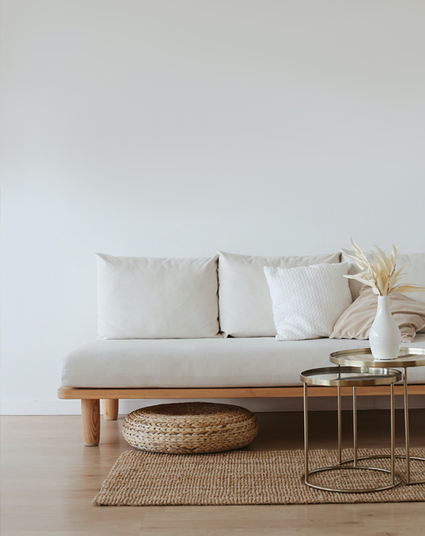
Neutral Rooms
South Africans tend to prefer more muted paint colours, and the latest colour on everyone’s lips is champagne. This natural amber colour hue is unique and has lots of personality. Champagne is a stand-out shade that perfectly captures the mood of the moment, adds an earthy touch to interiors, and creates a calming environment. It also pairs beautifully with bold colours.
Champagne and hues of white, are the ideal choice for a bedroom as we want to create a space to recharge and rest. A romantic glam look for the bedroom is also a big favourite and when you pair pale blue with champagne as a colour palette, you will achieve exactly that.
A suggestion for creating this glam look is to consider a striped pastel accent wall using alternate paint finishes, such as eggshell and satin. Keep the paint the same colour throughout, and the result will be a soothing, soft ethereal feel. Finish it off with an upholstered headboard and a long pile rug.[/vc_column_text][/vc_column][/vc_row][vc_row][vc_column][vc_row_inner][vc_column_inner][stm_icon_separator icon_color=”mtc” icon_size=”16″ icon=”fa fa-paint-brush” css=”.vc_custom_1598256083523{padding-bottom: 40px !important;}”][/vc_column_inner][/vc_row_inner][/vc_column][vc_column width=”1/3″ shadow_x_offset=”0″ shadow_y_offset=”0″ shadow_blur=”0″ shadow_spread=”0″ shadow_color=””][vc_single_image image=”55134″ img_size=”large” css=”.vc_custom_1598379571030{margin-bottom: 0px !important;padding-bottom: 0px !important;}”][vc_column_text css=”.vc_custom_1598379552591{margin-top: 0px !important;padding-top: 0px !important;}”]Image: Emily Henderson’s monochromatic lounge
[/vc_column_text][/vc_column][vc_column width=”2/3″ shadow_x_offset=”0″ shadow_y_offset=”0″ shadow_blur=”0″ shadow_spread=”0″ shadow_color=””][vc_column_text]
A Monochromatic Living Room
A monochrome palette refers to a colour scheme of different hues which are ideal for creating a minimalistic look. Grey is still a very popular choice and will stay with us for some time because of the simplistic look it creates.
In selecting a monochrome palette, start with a breezy hue for your main colour. If you choose grey, be mindful of cold greys and warm greys; the latter, in my view, is always a better choice. Select a slightly darker sofa to anchor the room and choose a rug in an off-white colour with a geometric design in a darker grey. You can then add a modern coffee table to complete the look.
A palette in black, white, and grey remains timeless and versatile. To complete your look, and to break any potential monotony, my advice would be to add texture such as wood, décor elements, and live plants.[/vc_column_text][/vc_column][/vc_row][vc_row][vc_column][vc_row_inner][vc_column_inner][stm_icon_separator icon_color=”mtc” icon_size=”16″ icon=”fa fa-paint-brush” css=”.vc_custom_1598256083523{padding-bottom: 40px !important;}”][/vc_column_inner][/vc_row_inner][/vc_column][vc_column width=”1/3″ shadow_x_offset=”0″ shadow_y_offset=”0″ shadow_blur=”0″ shadow_spread=”0″ shadow_color=””][vc_single_image image=”55132″ img_size=”large” css=”.vc_custom_1598379514978{margin-bottom: 0px !important;padding-bottom: 0px !important;}”][vc_column_text css=”.vc_custom_1598379505950{margin-top: 0px !important;padding-top: 0px !important;}”]Image: Bold powder room by Donna Mancini Interiors
[/vc_column_text][/vc_column][vc_column width=”2/3″ shadow_x_offset=”0″ shadow_y_offset=”0″ shadow_blur=”0″ shadow_spread=”0″ shadow_color=””][vc_column_text]
Go Bold in the Powder Room
The powder room or guest loo, is typically small, and ideal to be the statement space of your home. This is also the ideal room if you want to be a risk-taker and move away from neutrals. Go for bold wallpaper wrapped around the whole room instead of one accent wall.
However, if you don’t want to spend a mint, opt for paint in a bold colour like black, navy, or chocolate brown. Such rich tones are a perfect way to incorporate a luxurious look.
Olive green is another jewel colour that resembles opulence and glamour. Pair it with brass accents, such as a brushed metal faucet and a matching mirror. Simply stunning!
Navy also falls in the bold colour category and is growing fast in popularity. I previously mentioned that good colour matches comprising champagne and dark hues of blue are the perfect combination. Navy can be applied to the entire room as the paint colour of choice, can be applied on an accent wall, or as the main colour for cabinetry.
[/vc_column_text][/vc_column][/vc_row][vc_row][vc_column][vc_row_inner][vc_column_inner][stm_icon_separator icon_color=”mtc” icon_size=”16″ icon=”fa fa-paint-brush” css=”.vc_custom_1598256083523{padding-bottom: 40px !important;}”][/vc_column_inner][/vc_row_inner][/vc_column][vc_column width=”1/3″ shadow_x_offset=”0″ shadow_y_offset=”0″ shadow_blur=”0″ shadow_spread=”0″ shadow_color=””][vc_single_image image=”55128″ img_size=”large” css=”.vc_custom_1598379414626{margin-bottom: 0px !important;padding-bottom: 0px !important;}”][vc_column_text css=”.vc_custom_1598379478598{margin-top: 0px !important;padding-top: 0px !important;}”]Image: Charcoal and magenta by Sophie Robertson
[/vc_column_text][/vc_column][vc_column width=”2/3″ shadow_x_offset=”0″ shadow_y_offset=”0″ shadow_blur=”0″ shadow_spread=”0″ shadow_color=””][vc_column_text]
More Bold Colour Ideas
A bold colour enthusiast would combine what might seem as a clashing of colours. If you love bold furniture, such as a mustard sofa, put it on a multi-coloured rug against a navy accent wall. A piece of advice, however, is to off-set your bold colour items against simpler interior architecture, such as plain wood floors and white wall panelling. By doing this you create balance and sufficient breathing space so the interior is not overwhelming.
Another bold colour to consider is charcoal. It is chic and intimate and works well with bold colours like shades of magenta. Think comfortable chairs in magenta and purple on a striking pink mottled carpet.
[/vc_column_text][/vc_column][/vc_row][vc_row][vc_column][vc_row_inner][vc_column_inner][stm_icon_separator icon_color=”mtc” icon_size=”16″ icon=”fa fa-paint-brush” css=”.vc_custom_1598256083523{padding-bottom: 40px !important;}”][/vc_column_inner][/vc_row_inner][vc_row_inner][vc_column_inner][/vc_column_inner][/vc_row_inner][/vc_column][vc_column width=”1/3″ shadow_x_offset=”0″ shadow_y_offset=”0″ shadow_blur=”0″ shadow_spread=”0″ shadow_color=””][vc_single_image image=”55147″ img_size=”large” css=”.vc_custom_1598379380675{margin-bottom: 0px !important;padding-bottom: 0px !important;}”][vc_column_text css=”.vc_custom_1598379353712{margin-top: 0px !important;padding-top: 0px !important;}”]Image: Yellow accents by Du Bois Design Ltd[/vc_column_text][/vc_column][vc_column width=”2/3″ shadow_x_offset=”0″ shadow_y_offset=”0″ shadow_blur=”0″ shadow_spread=”0″ shadow_color=””][vc_column_text]
Yellow and Mango
Nothing screams fun and excitement like bright yellow? It is such a happy colour, be it in a shade of honey or the colour of spring daisies! It is very popular as an accent colour and can be achieved by incorporating crockery, lamp shades, or scatter cushions as décor items. Yellow works well in nurseries and workspaces.
Mango is such a striking and energetic colour. Like most bold colours, mango is ideal as an accent colour in living rooms or dining rooms. It is also ideal to accessorise a room with cushions, throws, an arm chair, or art work. It truly brightens up a room and a little goes a long way.
[/vc_column_text][/vc_column][/vc_row][vc_row][vc_column][stm_icon_separator icon_color=”mtc” icon_size=”16″ icon=”fa fa-paint-brush” css=”.vc_custom_1598256083523{padding-bottom: 40px !important;}”][/vc_column][vc_column width=”1/3″][vc_column_text]
Colours and trends will always excite us
Although trends stem from global inspirations, it will always be adapted by our talented and artistic citizens for relevance to the South African environment so that we can enjoy what works for us.
Let’s bring in new and fresh ideas to our living spaces inspired by the approaching season!
To choose your colour of choice from Olympia Paints’ vast selection, click here. To order your paint samples, or to purchase our premium-quality paints for your home, click here.
Happy painting and revamping![/vc_column_text][/vc_column][vc_column width=”2/3″][vc_single_image image=”49212″ img_size=”large” onclick=”custom_link” link=”https://staging.olympiapaints.co.za/shop/”][/vc_column][/vc_row][vc_row][vc_column][stm_icon_separator icon_color=”mtc” icon_size=”16″ icon=”fa fa-paint-brush” css=”.vc_custom_1598256083523{padding-bottom: 40px !important;}”][/vc_column][vc_column shadow_x_offset=”0″ shadow_y_offset=”0″ shadow_blur=”0″ shadow_spread=”0″][vc_column_text]For more décor and design information and advice, contact Martie Woehe.[/vc_column_text][/vc_column][/vc_row][vc_row][vc_column][vc_column_text]Share this with a friend. Click the links below:[/vc_column_text][/vc_column][/vc_row]
Leave A Comment